 Visual.ly is a marketplace for the creation of visual content of all kinds, including infographics, data visualizations, video and motion graphics. Their model brings together multi-disciplinary teams of talent required to create this type of work – integrating data analysts, designers, interaction designers, etc. Co-Founder and Chief Content Officer, Lee Sherman shares his thoughts on data visualization and the social sector in our continuing series of interviews of the leading practitioners in this fast-growing space. (Our thanks to guest curator, Greta Knutzen.)
…
What is the value of data visualization to the social sector?
I think one of the obvious applications of data visualizations is the social good space. Often you need to prove and back up your point with data and research. There is a lot of research done by organisations wanting to promote a particular cause. That data in and of itself is not very compelling.
Nobody wants to read a twenty-five page PowerPoint or read a research report.
Data Visualization can really distil this down into something that is much more understandable, manageable and visually compelling. You are in the business of trying to persuade people, to have them understand your cause and get onboard with it. You can start by saying that data visualization is a good way of breaking down complex information and turning raw data into insights.
In the social good space, it is even more important. There is such an imperative to get people on board, to contribute to a cause, etc. that you really want to use the most effective tools. Besides being a producer and enabler of this work, we are one of the largest distribution networks, with somewhere in the realm of fifty thousand data visualizations on our site, and a large percentage of them are for social good. I think this is why a lot of companies like Hyperakt and Periscopic have cropped up. Infographics and data visualization are a perfect fit for the social sector.
I think there is a spectrum. A lot of us think of ourselves as storytellers. I come at data visualization from the perspective of the end product, the presentation layer. Data Visualization is a great way to present the information, either in an interactive form or a static piece. The story has been developed in some other way through research or using a tool like Tableau but then you create something that you can share in social media for example or video. Video is a great way of getting the word out and gaining easier distribution. For example, we did a video about the History of Activism for Causes.com. I am proud of that piece because it was a powerful way of getting across the story of activism.
What makes an effective data visualization?
It comes down to the storytelling. The New York Times, for example, represents the gold standard of how best to use data visualization to help tell a story. They do a good job of building a story into the infographic. The less successful data visualizations are ones that don’t prompt an obvious starting point or ones with user interface issues. And there will be a few that, for whatever reason, just don’t get their point across.
The whole goal is to deliver insights and you want to be able to take people on a journey of discovery. The best data visualizations have the story baked into the visualization. Visual.ly promotes journalistic standards and a lot of people are now getting involved in this space and without that training. You’ll see people citing Wikipedia as a source, for example.
What advice would you give to a nonprofit wanting to use data visualization for the first time?
It isn’t as scary as it seems. It can be done for less money than you think. Seek out the options. Think about reusabilty. If you put out a quarterly report, you might have a relatively large upfront cost but incrementally it is not as expensive. Look at some of your tools. Find people who can help you build templates to better maximise your initial investment.
I am also a big proponent of video. A motion graphic video can be created a lot less expensively than one might think. We can make a thirty-second motion graphic video for five thousand dollars and you can find many uses for one powerful asset. For example we made one on the Mexican drug cartels (screenshots below) that garnered half a million views in two weeks on youtube and vimeo and was picked up by a lot of news publications. That is the kind of thing that can happen for a relatively small outlay. So, my advice, don’t be afraid of data visualization, look into your options and think about video.

Which organizations are harnessing visual assets most effectively?
We have done work for UNICEF, the United Nations, The Internet Society. The old days of sending around reports, the old ways of communicating don’t cut it anymore. It is partly due to the rise of social media. As an organization, you need content to share and infographics and data visualization make sense for the reasons we talked about earlier, they are effective tools with which to communicate complex issues and stories.
Can you talk about the projects about which you are most proud or admire?
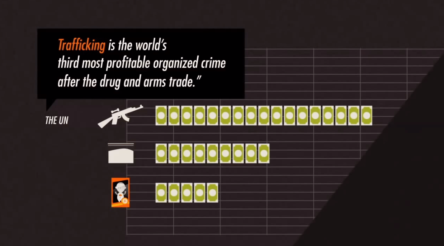
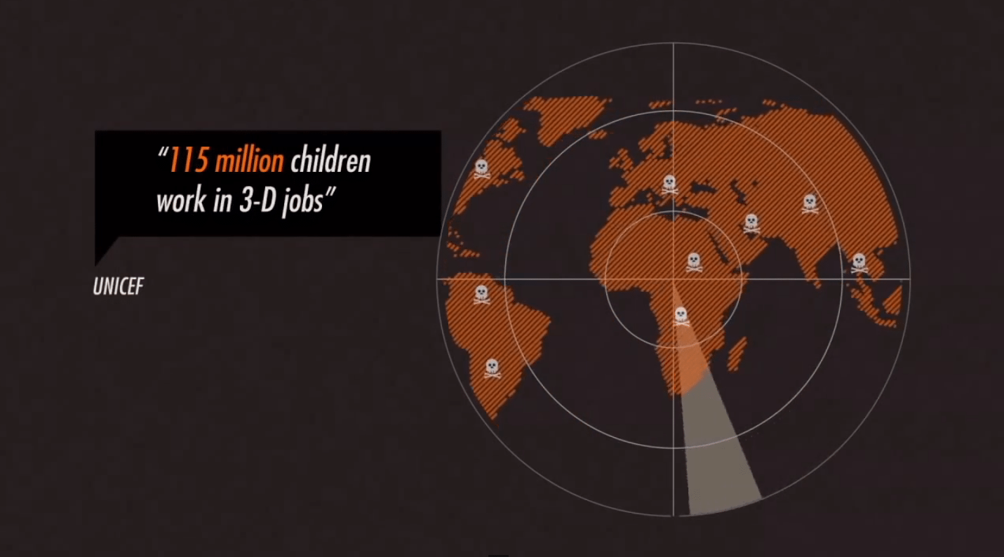
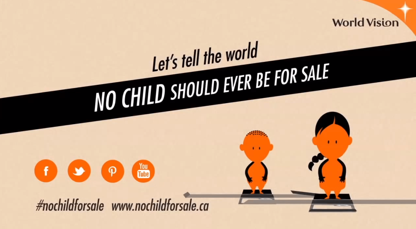
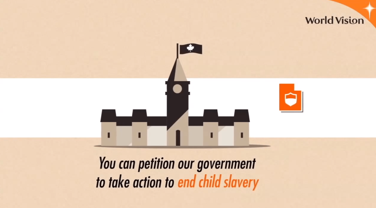
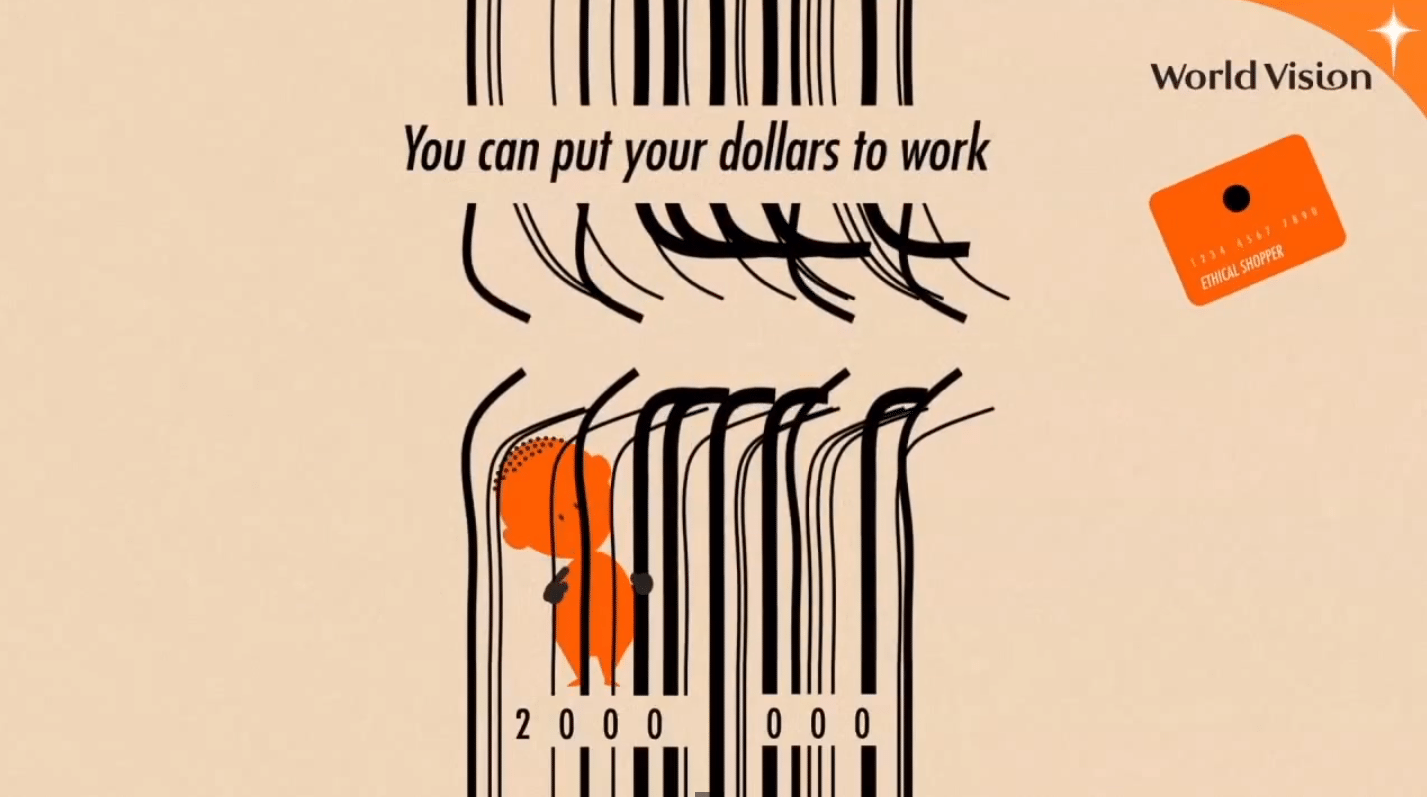
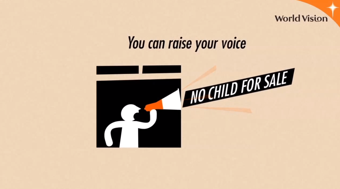
From our own work, the one that comes to mind is a motion graphic video we did for World Vision’s, No Child for Sale (screenshots below) campaign. That was very effective. The Violence of Mexican Drug Cartels motion graphic video was another. Outside of our own work, I love the work that Hyperakt, Stamen and Periscopic do.
What advice do you give to social sector organizations with a small budget who wish to utilize data visualization?
Look at budgeting for a series of static infographics because you will get more bang for your buck but it is important to do a series.
People come to us and say they’ve heard about this infographic thing and we would like to try it out and see if it works, and if it works, they’ll do more. That almost never works because you need to build credibility as a provider of good data and interesting sharable info graphics and visualizations.
It is better to say, “OK, we are going to do one of these a month.” And if you don’t have the budget for one of the larger pieces then you might be better off with static infographics spaced out on a regular publication schedule – one a month for example.
The second piece of advice I would give is think about motion graphic video. It can be very cost-effective and is very high impact when done right.
<end>