 Beth Schechter, Education and Outreach, Stamen Design, writes with Eric Rodenbeck, CEO & Creative Director and offers a fundamental insight to inform data strategy: think about the future – how you will maintain your visualization outputs and capabilities (both human and technological) on a shifting landscape.
This post is a check on both our ambitions and our processes. The uses of data visualization are different according to whether the goal is to communicate a specific thought for a single moment, e.g. as a poster, or the goal is to provide a durable tool for social change. It should be mighty safe to say that we want the latter, i.e. to take full advantage of the ability to create dynamic, interactive, real-time stories that make data plain and useful.
…
The data visualization community is a large, diverse, and growing one. As different as we all are, there is a vein that runs through all of us: earnest pursuit of the truth, love of information, and desire to share it in a beautiful, clear, understandable way. It is from this desire that the data visualizers produce some of their most impactful work, like Periscopic’s U.S. Gun Deaths in 2013, or Hyperakt and Ekene Ijeoma collaboration The Refugee Project. For us, one of these works is Crimespotting.
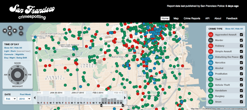
Crimespotting began as an independent guerrilla project, organizationally attached only to Stamen. We realized that it was important for residents of Oakland – a Bay Area city with a crime-addled history – to have more information about the crime in their neighborhood than just seeing police cars whiz by, sirens ablaze. Former Stamen partner Mike Migurski started scraping the Oakland Police Department’s API and sorting police reports by time, block, and report type. After Chauncey Bailey, a prominent local journalist, was assassinated in broad daylight in downtown Oakland, we decided to make this data public on an interactive map.
Not long after launch, two things happened. First, the City of Oakland turned off our access to their servers, which effectively shut down the project until we were able to connect with the city’s crime data department, who eventually turned into one of the project’s biggest supporters.
Second, the City of San Francisco asked us to create an officially sanctioned version of the project for San Francisco, which we did do. The San Francisco instance was launched in 2009, with Mayor Gavin Newsom at our side.
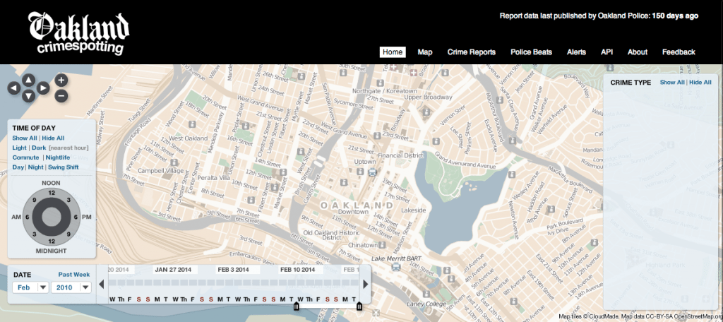
All of this happened over half a decade ago. In the years that followed, the project apexed with tremendous impact and support – including coverage in the New York Times and this video with Hans Rosling. But over the years, the project started wavering. Oakland’s API has sputtered to the point of being nonfunctional, rendering Oakland Crimespotting totally spotless. (see below) Although the San Francisco version has fared slightly better thanks to Stamen partner Shawn Allen and Jeff Johnson at the SF Department of Technology, it’s also broken several times. Only in the past couple of weeks have Shawn and Jeff found time to work on fixing it amid a medical leave. If not for these volunteered efforts, the San Francisco version would be as comatose as Oakland’s.
Watching the static nature of this project play out is painful, as is answering countless emails asking about why they are broken and when they will be fixed. We want to say that it will happen soon, but we know that reality dictates otherwise. We also know that it’s no longer acceptable to tell the public, “Sorry, it’s just that the code is creaky and the database is full.” We’ve come a long way since 2007, and the public expects better. They expect it to just work, and rightfully so.
I tell you this story because at this point it’s as archetypical as [a damsel in distress]. Too often we build works like these, only to see them falter and fail as browsers upgrade and technology evolves.
If you build a bookshelf, you take the time to design it once, to build it once, to finish and install it once. Dynamic data visualizations and other Web-based works are not quite the same. They’re more like plants, sprouted from the seed of an idea. Data visualization in particular also has a beautiful blossoming to it, one that happens naturally in response to the data, illustrated as pixels and color.
If you plant a flower in a garden and then never give it water or light, it will in fact die. Unless, of course, it happens to placed in just the perfect spot, in which case it will need to be pruned. Either way, some kind of tending is always required.
We don’t always think of digital works in the same way, perhaps because their metaphor of creation more closely resembles that of a built object, like a bookcase or building. But even buildings need maintenance, and after so many years, the shelves on the bookcase may falter and need new ones. We need to be more conscious about this aspect of dynamic data visualization, at the outset.
I urge of all our clients, in particular those who are making works for the public (which is most of them), to consider plans for maintenance. Luckily a lot has changed since 2007, and now more of our clients have some kind of web or technology team to take this work on. It’s part of their operating strategy. Clients in the nonprofit and municipal centers typically do not have those kinds of resources, and if they do, they are usually limited. What’s troubling is that these are the clients typically commissioning some of the most socially relevant work, yet their funding models typically only call for the build, and nothing beyond that. Nonprofits have the advantage of being able to fundraise (which is a TON of work), whereas governmental departments must rely on strict, slow process and very limited budgets.
If you are one of these bodies and you want to make socially relevant work, then we urge you too to think about how these works will live beyond the build and to come up with a plan (or at least funding model) for how it can be maintained. If not, all that work and money and time is going into something which is sadly, inevitably doomed. It’s not enough to visualize data, or to make it public: as data visualization moves from a flashy experimental genre to one that the public relies on, we need to come up with solutions that let them grow and change over time—to take the time to water and prune, just like we do our gardens.


