Christopher Ingraham explains how easy it is to radically alter data visualizations and the repercussions of decision making when working with poorly visualized data.
Jake Porway expressed in his piece “The Trials and Tribulations of Data Visualization for Good,” that, “data visualization without rigorous analysis is at best just rhetoric and, at worst, incredibly harmful.” Christopher Ingraham continues this discussion in his article, “The dirty little secret that data journalists aren’t telling you.”
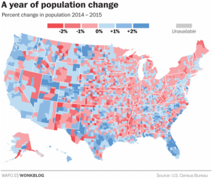
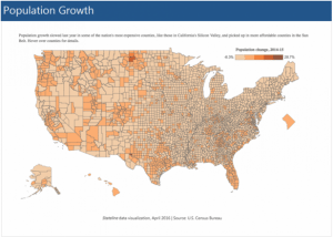
In his examination of data visualization, Ingraham finds that by altering a few data sets, he is able to produce an entirely different, and potentially contradictory, data visualization. While neither visualization is right or wrong, he explains that, “visualizing data is as much an art as a science. And seemingly tiny design decisions — where to set a color threshold, how many thresholds to set, etc. — can radically alter how numbers are displayed and perceived by readers.”
Pew Charitable Trusts recently released a story highlighting population growth in comparison to housing costs across the United States. Based on Pew’s interpretation and visualization of the data, population growth slowed in some of the most expensive counties, while it increased in more affordable counties. Ingraham explains how he took the same dataset as Pew, but by analyzing the data differently he created an entirely different visualization.

Visualization created by Wonk Blog

Visualization created by Pew Charitable Trust
As both Porway and Ingraham express, data visualizations are simply visuals. But when used for decision-making, the integrity of data visualization needs to be upheld. This discussion on data visualization and its capability for influencing decision-making raises questions about how we, as data users, maintain the integrity of data.
Read The Washington Post article here.
To stay up to date with the latest Markets For Good articles and news, sign up for our newsletter here. Make sure that you are also following us on Twitter.
