![]() To speak of “information infrastructure” is also to speak of the many habits that make up good practice. In that spirit, here are three tips you can use right now. But, more importantly, we appreciate that Josh Hurd, founder of NonprofitMetrics provides the context and rationale for each. Josh comes to us from a fast-developing niche on the social sector’s data landscape: subscription-based business intelligence. We hope this brief comment will not only give you tools for today, but also spark your thinking about essential problems-solving with data presentation.
To speak of “information infrastructure” is also to speak of the many habits that make up good practice. In that spirit, here are three tips you can use right now. But, more importantly, we appreciate that Josh Hurd, founder of NonprofitMetrics provides the context and rationale for each. Josh comes to us from a fast-developing niche on the social sector’s data landscape: subscription-based business intelligence. We hope this brief comment will not only give you tools for today, but also spark your thinking about essential problems-solving with data presentation.
…
We’ve all been there, cursing under our breath in frustration while trying to understand a horribly convoluted visualization. As Edward Tufte, data visualization’s minor celebrity, said, “There is no such thing as information overload. There is only bad design.” But what differentiates bad design from good? In this post I’ll go through three visualization tips and tricks that NonprofitMetrics uses to make our analytics informative and easy-to-understand at the same time.
1. Integrate small inline charts to make comparisons intuitive
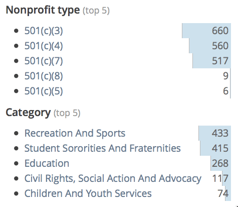
Wherever you see multiple numbers meant to be compared to each other, add small inline bar charts to help your audience comprehend magnitudes. For example, at NonprofitMetrics we provide business intelligence on the nonprofit sector through web-based analytics tools, which includes keyword searches to find specific types of nonprofits. After conducting a keyword search, we show our customers summary statistics on the matching nonprofits, such as how many are 501(c)(6)s or have revenues greater than $10MM. However, just providing these raw numbers makes it difficult to compare magnitudes. So we add inline bar charts to help our customers easily understand the information with a quick glance.
2. Use colors to convey information when charts are overkill
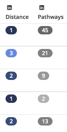
Effective use of colors can get across just as much information as charts, drastically increasing your visualizations’ accessibility. For example, at NonprofitMetrics we provide details on key personnel at major organizations, including LinkedIn integration to know which staff and board members are in your network. Our customers want to quickly glance at the personnel table to understand who they’re connected to. Just putting the numeric degree of connection, however, does not make the table easily understandable. So we color-code the degrees of connection, with a closer relationship getting a darker shade of blue. This drastically increases the user-friendliness of the table.
3. Modify chart axes to tease out insights
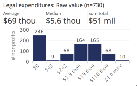
When using charts to display a multitude of data points, pay close attention how the data is spread across to x-axis and y-axis — you may be obscuring insights by displaying data in a raw format. This is particularly true when your data has a long tail or is heavily skewed. For example, at NonprofitMetrics we provide market research on specific niches within the nonprofit sector. However, fields within these market research reports, such as expenditures on lawyers and investment managers, have a very skewed distribution, with most nonprofits having no expenses in these areas but a few nonprofits having sizable expenses. Displaying this data as a standard histogram or scatterplot masks certain insights, such as the characteristics of nonprofits that do have these expenditures, because too much weight is given to nonprofits with no expenditures. To solve this, we modify the x-axis in our histograms, providing one bin for organizations with no expenditures, and normalizing the other data so our customers can better understand the overarching expenditure patterns.
 <end>
<end>