 Big Duck is a communications firm that works exclusively with nonprofits and focuses on three different areas: brandraising, campaigns, and training to help organizations reach supporters, build awareness, and raise money. Sarah Durham, founder and President of Big Duck, gives a grand tour here. Take particular notice of the “why?” of data visualization and strategies you can develop now to make your storytelling effective (in building constituencies, raising money, etc.) over a much longer shelf life than a one-time communication.
GK: What should a nonprofit think about when investing in a visualization project?
Sarah Durham: The question that a nonprofit really needs to think about is how are they connecting the dots between the content they are visualizing and the larger story that they are going to tell? If you are going to spend a lot of money to develop a really top notch piece of content then it really makes the most sense to leverage it over a long period of time across many channels. So, take those DIY tools where you to plop some data in and it will spit out a data visualization: I think those are great for a very quick Facebook post or something that you tweet, something very light. It doesn’t have to be perfect and it doesn’t have to say everything and if you put your brand colours in it feels a little bit related and you are done.
But, when you have just commissioned an academic institution to write a really in depth study of the impact of your work, for instance, and your going to visualize the content of that work you want to do it as well as you did the study. And you want to produce a visualization that not only tells the story of the content but also the larger story of your organization. To me this is a real branding opportunity.
GK: Walk me through a successful Big Duck nonprofit visualization project.
Sarah Durham: As an example we did a project for an organization called The Foundation of Jewish Camp. They are a client of ours, we have rebranded them, we have done a lot of work for them. What happened in this case was they had commissioned an academic institution to do a really deep piece of research around the question; If
you are Jewish and you send your kid to a Jewish Summer Camp, what happens? Do they feel more or less identified with religion? with cultural Judaism? what is the cultural impact? The academic research generated a tome of a report that basically said, “camp is great, send your Jewish kid to camp, they are going to have a great time and they are going to feel more Jewish.”
“Camp Works” (Book)
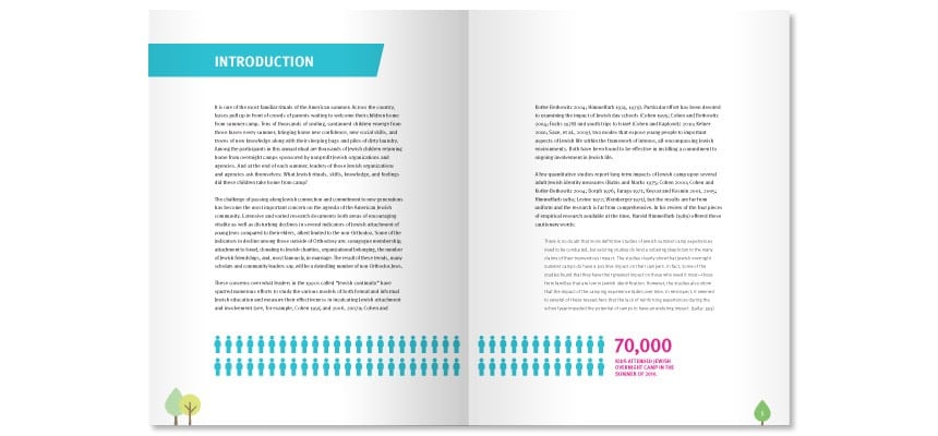
It proved exactly what they suspected but the question was how do you tell that story? And really it is a story not just about the research but about their whole organization, it is their whole raison d’etre. We took this research and we produced two pieces with it. One is a very small flyer, as you unfold it turns into a poster and we called it Camp Counts: The Long Term Influence of Jewish Overnight Camp and it has just a few very simple visualizations, it is not a complicated piece but it looks like the brand. If all you did was read the headline and see some bar graphs with high numbers, really, you’re done. You’ve got the whole point. For people who really wanted the deeper dive, who wanted to know the larger story, we took this academic research and we translated it into a more substantive 20 page book (graphic above) which has visualizations sprinkled throughout. We took the academic language and we not only made these visualizations but we also rewrote it in language that was going to be accessible to a donor, someone who runs a summer camp, to a parent. Which I think is the other piece of visualization that I think is often overlooked. We think of data visualization as being about design but it is also about the message. How the story is told.
The message I’d like nonprofits to think about is not to just focus on the content. Connect the dots of the content you are visualizing to the larger story you are trying to tell; your organizations positioning to the mission, to the brand. When you do that, you end up with a piece that is useful for different audiences, which you can use amongst multiple channels. Now that is worth investing in.
And that is a very different way of using visualization than something you just post on Facebook and it has a shelf life of three days. If you are going to spend money and hire a designer, hire an agency, you want to be able to maximize that asset.
GK: Walk me through how you create a visualization project such as Camp Counts.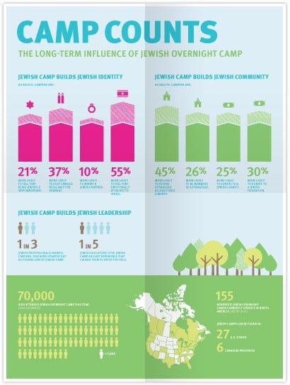
Sarah Durham: The way we think it works best is to think of it in three phases:
The first phase is the discovery phase. In the discovery phase, whoever is going to lead this project needs to sift through the data and pull out the themes and the stories the data is telling and do some sketching and think about how can I translate this complex pile of stuff into something that is simple and elegant and tells an effective story. The discovery phase is really where you have to feel confident you are in good hands. It is really a lot like going to the doctor with a set of symptoms and asking the doctor to pull together a simple coherent diagnosis that you can build on. I find that the people, who produced the data, find that extremely difficult to do this themselves. They are usually able to say, ‘good news, our study shows that our mission works or good news our study shows that this audience really cares about that.’ They either talk about the data at the fifty thousand foot level or in the trenches. They have trouble identifying the stories that are interesting to people on the outside. Having somebody in the discovery phase who is looking at it with an outsiders lens is useful. Again, it is like a doctor. A good doctor will ask you questions that you didn’t even think were related, that help piece the story together.
Phase two is creating whatever the visualization is. From phase one we end up with notes, sketches. Sometimes it is formal, sometimes it is back of the napkin. Sometimes if it is an organization we haven’t worked with as much or there are a lot of people involved, we start with wireframes of what the visualization will look like – not a fully baked design but something where you can see where it might be heading – a road map of sorts. And then in phase two you are really writing and designing the whole thing. In many ways it is a fairly typical design process. What is unique about visualizations is the way copy and design work together, it has to be really really tight. I think it is important for the designer to have a strong ability to write and edit and work with language. Our preference is to have a designer who is a strong copywriter do the whole thing and change the copy. When we give it to the client, the client is going to edit it but at least they understand what the length, placement, tone should be. It is a way to translate the copy into more audiencecentric terms.
The third phase is really about getting it out there in smart ways and measuring its impact. Getting it out there might mean thinking about how this visualization is going to be used over a period of time. Thinking about its uses online, its uses in print, its uses at events. Does it go in your annual report as an illustration? Does it go on your website? Is it in and of itself a microsite? Can you extract elements and use them as slides when your Executive Director is giving a presentation?
Think about all the ways that content can be repurposed so you can get a lot of mileage out of it. And then build into the process some way to measure its efficacy. If our goal was to make sure that donors are inspired to give because we made an effective case for our mission. How do we know we have done that? If the visualisation is online you can measure how many people have visited the site or have clicked through.
At the bottom of the ladder of engagement where we are really just trying to catch someone’s attention and get them to show some interest. And at the top of the ladder of engagement are trying to get them to make a commitment to take action. Those things are measured differently. At the bottom of the ladder of engagement you measure sign-ups or click throughs. At the top of the ladder of engagement you might measure gifts. If we used this piece in our annual donor report, in our donor cultivation activities, how many of those people gave?
The feedback may be largely anecdotal. The real reason to measure it is to assess the ROI of doing the visualization in the first place. If you are going to spend twenty thousand dollars and up on a really substantial data visualization that is a really big investment. If you make that kind of investment in a piece, you want to be able to justify that expense and to know if you should do it again.
GK: Which organizations use data visualization effectively?
Sarah Durham: The most obvious example of an organization that is doing this very well is charity:water. My sense is the reason they do this really well is that they have developed a robust and multidimensional inhouse creative team. They do video well, they do visualization well and that is because they have people with titles like Creative Director. Almost no nonprofits do and I think that they have really leveraged a way of staffing for communication to their advantage which is a big tell. Nonprofits who hire Big Duck or Hyperakt are outsourcing stuff because they don’t have the capacity to do it in-house. A nonprofit like charity:water is investing very seriously in communications and there is definitely a story to be told in that.
GK: What does the future of communications for nonprofits look like?
Sarah Durham: The future of communications for nonprofits looks very different than it does now. The old model of communications for nonprofits was very PR orientated and traditional media centric. The new model in five or ten years will be much more dynamic, water has done which is to staff up on a multidimensional in-house team with a lot of skills and take risks, try new things and invest in that. If we did an analysis of who is doing really cutting edge and successful communications it is more likely it is the organizations that have been willing to take the risk online orientated and much more embedded in staff capacity. I would say that the vast majority of nonprofits are somewhere in the middle There are very few nonprofits who have reinvented their communication departments to take advantage of how we can communicate these days. Most nonprofits are not ready or willing to do what charity:water does.
GK: Which resources would you recommend to nonprofits wishing to familiarise themselves with effective visualization?
Sarah Durham: I like Pinterest. I am bigducksarah. What I like about Pinterest is that it isn’t filtered by any particular point of view. I like the crowdsourced aspect because sometimes the most powerful visualizations in my experience are often the simplest. Sometimes the people who write, blog about this have a very particular design bent or design aesthetic and I would argue that for a nonprofit it doesn’t need to be about that, it needs to be aligned with the brand or organization. Sometimes my favourite visualizations are the super duper simple charts, not fancy, just an illustration with some notes. If you scroll on my Pinterest board there is one that I love, The Complete Guide To Beer. It is a nice illustration with some type. I think less is often more and I think what bubbles up to the top on Pinterest does so because people think it is useful and they repin it, that is the mark of an effective visualization, if people share it.