 User Experience professional, Nikki Roda, brings a perspective built for our times, fueled by her varied experience and a data journey that began with a conscious eye on us, the users, as she studied “how to make information useful for everyone else who isn’t a data obsessed nerd like myself.”
It’s cool to take a “deep dive” into strategy, tactics, technology …and all the other smart words I can muster to talk data visualization. But, really, it’s just fancy snorkeling if we don’t engage the users: nonprofits, volunteers and the people we say we’re out to help. Here, Nikki not only comments on the state of “#dataviz,” but also shows what that work looks like with proper focus on beneficiaries. — Our thanks to Greta Knutzen, Guest Curator, for this latest dispatch in her series of interviews with pros on the front lines of data visualization for social impact. Take care -Eric J. Henderson, Markets For Good
…
In one or two sentences, describe the value of Data Visualization to the social sector.![]()
Data visualization offers social sector practitioners a way to observe patterns, trends, and outliers in data they deem relevant for their decision-making. Visualizations can also be a great storytelling tool for nonprofits to show, rather than just tell, the public about the value they are adding to society.
Describe one of the projects about which you are most proud and why (please provide relevant links/images)
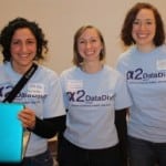
Nikki Roda at A2DataDive
I’m extremely proud to have been part of the team that launched the A2 DataDive at the University of Michigan, an annual event inspired by the work of DataKind. Every year students at the School of Information bring together nonprofits looking to make sense of their data and local data scientists, students, and data-curious learners for a weekend of skills sharing, volunteering, and – most importantly – data analysis and manipulation. The nonprofits we helped, I remember, described their amazement at how much they learned about their own organizations over the course of the weekends. And I will never forget how thankful the data volunteers were to have a venue to give back to local causes they supported in a analytic and thought-engaging way. Volunteering to them usually meant helping out at a local soup kitchen or maybe painting a nursery at a local child care center. Events like the A2 DataDive demonstrated that there are many other exciting ways for nonprofits to engage volunteers towards helping deserving causes.
What advice would you give to a nonprofit or foundation thinking of using Data Visualization for the first time?
I would caution them to start small. Data visualization tools and techniques abound and excite with all their variety, color, and interactivity. But simple charts (bar, line, pie, etc.) can have much more explanatory power precisely because their lack of pizazz let’s the data speak for itself. As with all storytelling, a first principle should be “Know your audience.” How much familiarity do they have with the data being presented? How can you illustrate the ‘story’ of your data in a clear and accurate way? Starting simple will be the best way to gain insight over any interesting features of your data.
Which Data Visualization tools would you recommend and why?
For nonprofits that are just beginning the process of becoming data-driven I would strongly recommend using Excel, for the following reasons. As part of the Office Suite of applications it comes standard on most PCs and is immediately compatible with most office software (Word, PowerPoint, Outlook mail, etc). As a result there are innumerable tutorials, books, and websites dedicated to helping beginners master the awesome collection of tools built into Excel. And finally, it can be an all-in-one package for data science because it comes standard with tools for data management, data manipulation, and standard data visualizations. Having conquered Excel, a nonprofit hungry for more tools could consider looking into learning the statistical programming language R, which has a powerful visualization library called ggplot and the user-friendlier IDE R Studio. Similarly, the programming language Python has libraries for data collection, manipulation, and visualization, and has the benefit of treating the objects under observation more like a standard programming language than R. When you’re done with the analysis and ready for the presentation of your findings, there are also web visualization tools built on JavaScript such as D3, Highcharts, and Google Charts.
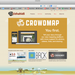
Ushahidi Crowdmap
Which social sector organizations do you feel harness Data Visualization most effectively and why?
I think as an interaction designer I’m predisposed towards visualizations that give and take information from its audience. For example, I’ve always been amazed by the work that groups like Ushahidi, who dynamically populate interactive maps with information submitted by community members. Maps are a type of data visualization that has universal recognition and as a result immediate impact. These types of tools help both users and service providers make sense of a quickly-changing on-the-ground reality.
Can you describe your dream DV project?
A dream data visualization project for me would be one where the intended purpose was to create something that would be used by the community members. We all know how valuable good information can be for organization decision making and for driving change within institutions. But an ideal project in my mind would be able to apply that same principle to communities and individuals I was trying to serve. Whether that meant disseminating information on homeless shelters that have vacancies to mobile phones, or mapping out available after-school opportunities, or creating more targeted outreach campaigns because we understand the needs and desires our beneficiaries better, there are so many ways that data visualizations can have an influence on how we better serve useful information to those in need.