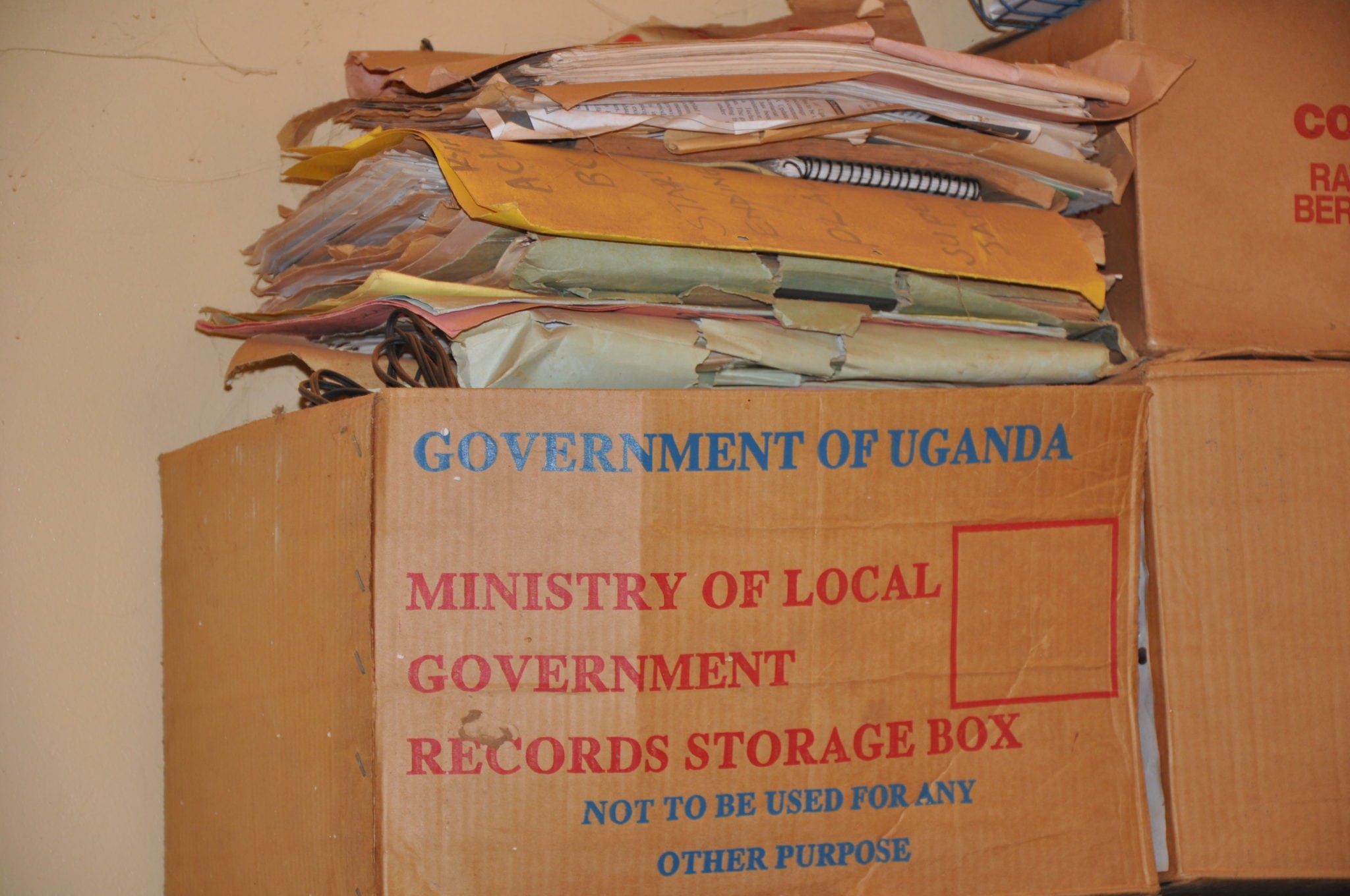
In their second piece on the state of data in Uganda, Bernard Sabiti and Bill Anderson share their frustrations for when data alone doesn't tell the whole story.
In part one we discussed the challenges of data collection in Uganda. In today’s follow up piece, we have further hurdles that we need to overcome and some rude awakenings in making sense of the collected and analysed data.
This lesson started when we embarked on an effort to build our first comprehensive, joined-up dataset on Primary School Leaving Examination (PLE) results for one of our two pilot districts, Katakwi and Kitgum. The 2014 Katakwi PLE results were mostly poor, with most schools having more students getting grades that would not promote them to secondary schools. This being a rural district, with most of the schools run by the government under its Universal Primary Education (UPE) programme whose ills are well documented, we were sure we knew what data to look out for to explain these results.
Our efforts began with getting our hands on the PLE results per school. We then gathered data for each school on enrolment totals (calculating pupil–teacher ratios), staff salaries, staff capacities and budgets, and compared them with the performance of each school.
We then stepped back to look at the non-puzzle we had just solved. But then looking closely at the data, we began to develop this eerie feeling that the data was wrong. The reason was: our elitist assumptions of why students failed had proved to be largely false.
For instance, the data on pupil–teacher ratios did not correspond with the PLE results; that is, the fewer students per teacher in a classroom, the better results. Some of the schools in Katakwi actually have a lower pupil–teacher ratio than national averages . In some instances, schools with higher pupil–teacher ratios had posted better results than those with lower ratios.
The school budget and salary data didn’t tell us any stories either. Teachers in government schools, even with their regular strikes against low pay, still receive higher pay compared to their counterparts in private schools, especially in rural areas; yet the latter almost always post far better exam results than government-run ones, as was the case in the 2014 Katakwi PLE data we analysed. The best school, for example, is a private one whose owner pays his teachers a significantly lower salary than that paid to teachers in government-run schools.
So, what then could explain the examination performance of students in Katakwi district? We had failed to tell a coherent story with the data we had put together and needed to look elsewhere for answers.
We went back to the district and had engagement meetings, interviews and dialogues with selected district stakeholders in the education sector. These included parents, teachers, technical officials who run the district education department, and local non-governmental organisations working on education issues. We particularly focussed on those schools with really bad results and compared these with a selection of better ones.
We were humbled hearing some unexpected stories on the challenges the entire education sector faces, and in particular school-specific challenges that explain why some students do very badly in exams:
- Katakwi is a rural district in eastern Uganda. Some of the schools are extremely rural and access to them is difficult. We were told tales of a school (the worst performing one) whose teachers arrive at 11 O’clock because they have to travel over 15km to get there from home, and yet many have no transport means and the school offers no housing for its staff.
- Most of the schools do not provide lunch. The afternoon lessons therefore take place during, in one of our respondents’ words, the ‘sleeping time’ for the hungry students.
- There are still several ‘under tree’ schools, and at least two of the worst performing ones were in this category.
- Teacher absenteeism is high, and the district education inspector has no adequate supervisory funds to police all the 74 schools in the district as regularly as necessary. Absenteeism is also chronic among the students, whose parents and guardians send them to work in the gardens during the planting season and to the market during market days.
Since our proactive, ‘follow the money’ approach to analysis failed, we have embarked on a new challenge: find the data that supports the intuition of the people on the ground. Some of the data we have been able to find in the Education Management Information System (EMIS). This data, some still not accessible because we need special permission from the ministry to get it, include infrastructure data (buildings, textbooks, etc), distances between home and school and other geographical data, teacher and student attendance rates, etc. While we are well aware of the challenges of the EMIS, which have been documented, we still believe it is a fairly reliable database to use. The districts also collect data during supervisory and monitoring visits, which can be found in district quarterly and annual reports and work plans. We have as a result created an inventory of the data we need, the data we have and that we do not have, what is publicly available and what is not, in order to determine our access strategy.
The big lesson we have learnt from this is that proving or disproving the theories and intuitions of the people at the beginning of the data chain, rather than our elitist, conventional ones is the better approach to making sense of the data.
Many thanks to Bernard Sabiti and Bill Anderson for their follow up piece, which so clearly describes the challenges around collecting the right data from the beginning. If you missed it, you can read part one of their ‘Adventures in the Data Revolutions’ here.
To stay up to date with the latest Markets For Good articles and news, sign up to our newsletter here. Make sure that you are also following us on Twitter.

