![]() To close our data visualization (dv) series, guest-curated by Greta Knutzen (GK), we are, well… kicking the tires on an earthmover. There’s a lot of content here (worth the ride!) in this round-table interview with the Office of Creative Research, a newly established design agency responsible for some of the most beautiful, mind-blowing and revelatory data work in the field. Their work has been exhibited/featured at MoMA, The New York Times, Scientific American, Fast Company. Greta Knutzen, Guest Curator, sat down with Ben Rubin, Co-Founder & Principal (BR), Ian Ardouin-Fumat, Designer (IAF) and Sarah Hughes, Project Manager (SH) in OCR’s Chinatown office in New York to discuss the specific relevance of data visualization for the social sector. [Ever wonder what’s behind all the ads on your screen and how dv can empower you to take control of your web profile? They’ll talk about that and much more, exploring the edges of dv and how it can work for social good.] …
To close our data visualization (dv) series, guest-curated by Greta Knutzen (GK), we are, well… kicking the tires on an earthmover. There’s a lot of content here (worth the ride!) in this round-table interview with the Office of Creative Research, a newly established design agency responsible for some of the most beautiful, mind-blowing and revelatory data work in the field. Their work has been exhibited/featured at MoMA, The New York Times, Scientific American, Fast Company. Greta Knutzen, Guest Curator, sat down with Ben Rubin, Co-Founder & Principal (BR), Ian Ardouin-Fumat, Designer (IAF) and Sarah Hughes, Project Manager (SH) in OCR’s Chinatown office in New York to discuss the specific relevance of data visualization for the social sector. [Ever wonder what’s behind all the ads on your screen and how dv can empower you to take control of your web profile? They’ll talk about that and much more, exploring the edges of dv and how it can work for social good.] …
“OCR is reshaping the relationship between client and designer, client and technologist, client and data scientist.”
…
GK: What is the value of DV for the social sector?
IAF: It is easy for people to relate to social matters because it concerns them right away. Data visualization can help to simplify complex issues, but more importantly it can reveal something that wasn’t visible before.
When I see myself included in a DV, when I can recognize that the data concerns me – for example, we did several projects about online privacy and security, which are matters that I can relate to – when I can see myself in the system, it is way easier for me to be engaged in that content. I think those are two attributes of DV that are extremely important: the ability to see yourself as an individual within the system, and the ability to compare yourself to others. I think that is one of the most effective mechanisms with which to engage an audience in any matters, be they political, social, environmental…
GK: Can you describe some of the concrete ways in which data visualization can advance the mission of a non-profit?
IAF: We worked on a project called “Into the Okavango” – a cool project we did with The Wild Bird Trust that followed an ornithologist and his team during their 15-day exploration along the Okavango Delta in Africa. 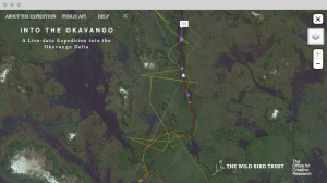 During the process they were streaming data related to the expedition – all their sightings, GPS paths, when they saw animals they were interested in, pictures of the animals and birds they saw. Every day we were getting new data,and by revealing that information in a way that was not just purely data dense, it made the process so much more transparent for a large audience and more interesting for the scientific community,. It is so much more exciting and immersive for people to be able to follow the process.
But we didn’t only publish the website to explore that path, we also provided people with the API to do whatever they wanted to with the data. We had a small stream of data and a very simple interface – but if you provide people with the tools to go further, it creates a very interesting set of possibilities.
BR: “Into the Okavango” is a great example of an interface that takes you through the data level onto the ground. Doing that allows for a real emotional resonance – that and the design, the context in which you place things.
Those are key elements necessary for people to benefit from these projects. They need to be more than simply a quantitative tool or a comparison tool; they need to touch an emotional chord to propel the audience to act in some way, be it voting, donating, engaging…
But when we at OCR talk about creating an emotional resonance in our work, we also presume a rigorous understanding and a faithful and truthful presentation of the data. That is a fundamental prerequisite of the work.
GK: How can non-profits start to engage with their data?
IAF: It starts with knowing your data. What does your data set look like? How much data do you have? What is the texture of the data, it is full of holes? Then you will start to have some intuition about the direction in which you want to explore. Our process at The Office of Creative Research is to keep exploring. We have a long phase at the beginning of a project where everyone sits at their desk with the data and makes very small visualizations, simple ones that take just a couple of hours to make, as a way to explore the data. It is an iterative process. We create those small, simple tools for ourselves so we can begin to ask the right questions. You can have questions about your data, but you might not be asking the right ones. At some point in this process the data will reveal something you hadn’t thought about in the first place and that is when the data gets really interesting. You will find something you didn’t think about initially.
BR: Right, if you know what questions you want to ask before you start this process, you are probably not thinking about the data in the right way. You need to get very deep with the data. Once you get into the data, it will start to reveal shapes and patterns that you didn’t necessarily expect.
IAF: Data visualization is not a communication tool on its own. It depends what you eventually do with it. In the first place it should be a tool for you, as an organization, to learn something. When we build a visualization tool, we don’t expect anything from the data. Well…we will have intuition about the data but the goal is to go beyond that to learn something. If we didn’t learn anything during our preliminary work that means we missed something.
First you have to learn something from the data set and then it might become a communication tool. The first and most crucial piece is to learn something.
BR: What people are used to is seeing these tools as a much sexier PowerPoint deck, showing the beautiful graph of money being spent and results increasing, things getting better, etc. But DV can be so much more than that. DV, as Ian says, is not necessarily a way of making those kinds of points – it can be much more valuable because it can be a way for people to engage and really get inside the data. Ideally our interfaces, the really good ones, I would say, are centered around that idea of exploration as the mode rather than simply showing a result.
It means that a prerequisite to this type of work is a kind of openness at every level. What if the data doesn’t show what we expected? I guess in this business the ultimate ethical stance is that you have to listen to what your data tells you.
A DV may show that an organization’s main mission might not be going as well as they had hoped, but they may discover that they are accomplishing something else that they hadn’t even anticipated. Unintended consequences, both bad and good, are a big part of this kind of work – look for the unintended consequences on both sides and see if some of those insights reveal what the mission should in fact be.
GK: What makes an effective visualization?
BR: Emotional resonance, but not to the point that the emotional content starts to interfere with being faithful to the data. It’s about finding that balance – and it is easy to fall off either side! You don’t want to impose so much structure in the course of making the piece legible that you dictate the narrative, but on the other hand, if you don’t impose enough structure, people are just lost in a sea of information.
IAF: Jer Thorp [one of the other OCR co-founders and principals] has an expression I really love. He says that a good data visualization should have the “Oh, Ah” effect. At first you show people the visualization and they go “Oh, that is really impressive and spectacular!” and they are engaged because of that “wow factor” – that is the emotional resonance we were talking about. Then they say “Ah” because they are actually learning something from the visualization. First you have to engage them with something that is compelling and visually appealing, and then you let them explore and ask their own questions. And that is when we know if we have done a good job or a bad job, because sometimes people will say, “Oh, that is beautiful!” but then they won’t go further. Sometimes, though, they do get into it and they start exploring and using the tool we have created and that is when they start learning something. In my opinion, that’s when we can say we did a good job on a visualization. It’s about finding the balance between emotional resonance and encouraging people to explore questions on their own. We are providing a tool for them to ask questions.
BR: It is a really good sign when, in addition to the visualization, the data itself is provided. It should be the standard.
All data visualizations should allow access to the raw data with which they were created. When we create a DV, we are showing you the data in a certain way but we also say, “Please, here is the data. You are welcome to draw your own conclusions out of it.”
This creates confidence that we’re not just giving you our spin on this data, that in fact this is what this data says. It is critically important to provide information about how the data is collected, how we got it: “it was collected in these specific circumstances; it was collected using these surveys, with these measurements, with these observations”. Providing that sort of package, which includes not only the visualization end product but also the raw data, the information on how it was collected, the potential weaknesses in the data collection – this really increases the integrity of your work.
IAF: Giving advice to small or midsize organizations willing to step into the data world, I’d say an effective visualization starts with freeing the data. Making it open, making it accessible to people is a great way to get them interested in your data, your mission.
BR: Organizations are afraid of opening their data and it is a big problem we face.
GK: Can you describe one of the projects of which you are most proud and why?
IAF: So one year ago, we made a project called “Behind the Banner”. It was about online privacy and identity, something that really interests me. This visualization is more of a narrative than an exploration tool, but one of the first we did online. It visualizes how advertising placement works on the Internet, for instance when you open up The New York Times webpage and there is advertising customized for you. We realized that very few people understand how that works and it is such a huge part of the online experience.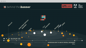
So we made a visualization with John Batelle, co-founder of Wired Magazine, from Batelle Media. This visualization reveals the whole system of advertising placement on the web. That is incredible. Something we couldn’t have imagined doing at first.
So the way this works is, first, you load a webpage. Then there is an ad request from the publisher, let’s say it is The New York Times. Then there are hundreds of companies on the web trying to build a portrait of who you are and, ultimately, how much you are worth as a consumer. And then there will be two rounds of auctions between thousands of advertisers to determine who is going to spend the most money to display an ad that is “right” for you. And all of that happens in two tenths of a second, and it happens for every ad that is displayed on every webpage. It happens billions of times a day.
Our visualization revealed that whole process. We were discussing it with John Batelle and he was telling us that really only a handful of people in the world are aware of this system. Working on the project was incredible because it’s a huge social issue, it concerns everyone. “Who I am on the Internet” seems like such an abstract thing, but it has such a huge impact on my life because the portrait the Internet has of me is who advertisers think I am. That is pretty much my public identity. I was very proud of this project, as it revealed a system previously hidden to most people but which affects everyone who uses the Internet.
We have actually started to work with the Ford Foundation and we are partnering with Ashkan Soltani, a journalist who frequently covers privacy matters for the Washington Post. He has been covering the NSA and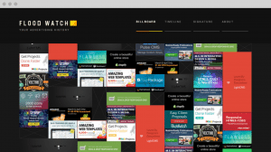 the Edward Snowden story. Together we are creating “FloodWatch”. It’s a record of all the ads we are served when we browse the Internet. We are building a visualization to provide people with a history of all the ads they are being served, and to give them a sense of who they are on the Internet. “How am I defined on the web by the ads I am seeing?” It allows you to see how you fit in, in terms of advertising on the web, and also to compare yourself to others.
The Ford Foundation is interested in this project as a way to understand how discrimination manifests on the web. It might not necessarily be nefarious but it can slide in that direction. There is no practical way to collect data on this,which is why FloodWatch came about. It will allow people to monitor themselves and start to see who the internet data brokers think they are, and then allow them to elect to share this data in an anonymized form. Then we can start to establish baselines and have an informed picture of what this discrimination actually looks like.
GK: What advice would you give to smaller and midsize organizations wanting to play with data?
IAF: Open your data, because there is such a shortage of data. Good data sets are actually really hard to find. I am sure that there are many freelance people in the data world who are extremely interested in that data. So, opening that data is the best advice I can give.
BR: And in fact, opening that data up may come back around and start working within the organization to help unlock it and to help it deal with the fear of data that many organizations have. It happens so often, even in the corporate world, that companies come to us and say they really want to open their data and visualize their data and we get a contract and we start to work and Step One is to give us the data. And that is when the people who hired us discover that there are multiple obstacles within the organization to releasing that data, whether they are technical obstacles, administrative obstacles, or legal and security obstacles.
GK: Which data visualizing tools do you recommend?
IAF: When I am asked that question, I always direct people to selection.datavisualization.ch. It is a very extensive list of great tools, from the reasonably sophisticated to the very easy-to-use, such as Leaflet, which is pretty awesome. We used it to build Okavango. What is great about this site is that you have tools for any kind of content you might have. If you want to build timelines, there are many tools to build timelines. If you want to build something that is geographical, Leaflet is great, and Matte Box as well. It really depends what you want to create, but there are many, many easy-to-use tools.
If you want to step up your game and go further, we at the Office of Creative Research tend to use Processing a lot. We think it is a great tool because it isn’t meant for engineers, it is meant for artists. At OCR, we are not programmers foremost, we are designers. Processing is such a good introduction to programming, with an artistic angle to it. If you want to go further than the tools that are designed for a specific task, Processing will let you do just about anything and it isn’t as heavy or as intense as learning coding languages like Python or Ruby. Processing is not really a tool, it is an environment that allows you to build your own tools.
BR: It is important to note that the tools will dictate the visualization.
There is no visualization tool that is going to get the perfect essence of what you’ve got. It is important to understand that. The tools have already asked a certain set of questions and shrink-wrapped them.
And some of them are beautiful, and some of them ask really provocative questions, but they are not going to ask you the specific questions that you might have about your data. You have to look at this whole visualization process as part of a bigger iterative process about data collection. We are kind of at the beginning of this whole thing. As you start to visualize your data, you will find yourself wishing you had asked for the incomes of people as well as their ages, for example, since your data is incomplete. All data is a rough facsimile of reality, and you may find you are missing the critical pieces you need to leverage what you have and the story you want to tell. And that comes back around and hopefully helps you reevaluate what data you, as an organization, are collecting.
IAF: In fact, the bigger the organization, the harder it is to get the data working for us. Data collection is often done with no purpose, no particular goal in mind.
GK: What does your dream data viz project in the social sector look like?
BR: I love projects where language is at the core of the data set. If it is people, people in their own words.
IAF: I like to work with data that has to do with people. As soon as the data is interconnected, it makes it so interesting to analyze the networks of organic systems that evolve and are not visible. It has to be about people and it has to be interconnected.