We are pleased to welcome Peter Grundy, the “father of infographics” to the conversation, with groundbreaking experience that began in the 70’s and continues with a sharp look into the future of communicating information. He opens with a quote: “The humble basic communication of information has never had the glamour of other areas of design. The creation of a poster casts the designer as an artist. Bringing into being corporate identity for some giant multinational company showcases the designer as a business strategist. But the design of a map for a housing project…what sort of designer does jobs like these?” – Hugh Aldersey-Williams on Grundy & Northedge, Graphis 305, 1995.
—
Too much data
There’s been an explosion of easily available information in the last 15 years and its created a huge need for designers and illustrators to visualize it. Otherwise, how are you going to take it all in? But it hasn’t always been that way; I was there before the digital eruption.
When no one cared
In 1980 no one was interested in designing or illustrating information or data. That’s why Tilly Northedge and I started a design studio called Grundy & Northedge to do it well – because no one else cared.
In contrast to the desperately dull graphs, bar charts and analytics of the time, we set about finding a new way of information design to visualize and explain data. We found solutions in pictograms, icons and pictures with a secret ingredient, IDEAS.
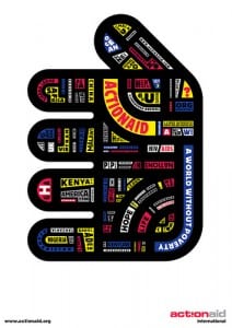 [click for full graphic, summary]
Further, we realized that the best way to explain something visually is to grab the viewer’s imagination. This was a thousand miles from the purists who taught us that the information designer should be invisible and anonymous and never get in front of the information, since to do so would contaminate the meaning. “To hell with that,” we thought.
The first epiphany came with one particular job for Blueprint magazine in 1990. I realized we were not visualizing information but visualizing our opinions of the information. Not a thousand, but a million miles from the purists, I should add.
This was an article on how London had changed over 50 years. We were asked by the editor, Deyan Sudjic, to collect the information and visualize it on a spread with as few words as possible. Here we became journalists and got an early glimpse into the emerging power of visual explanation. The response to the article was actually very negative.
Many readers saw visualisation of information as trivial and confusing. But, people’s visual literacy was low in 1990. Over the next 20 years that changed; people learnt to see, probably because of the explosion of visual literature and the need to adapt.
Making things simple is very complicated
The second epiphany came in 2000, in the very midst of the digital data revolution. I started working with Shell on their “scenario” program. As I listened to the abstract concepts they wanted me to visualize, I thought, “This is impossible.” On the way out, I saw the pictogram of a man on a toilet door and wondered if I could make a simple icon like that act out all this knowledge. And so it came to be.
I discovered the power of a simple idea. But simplicity is not easy. Arriving at the concepts that drive that simplicity is difficult. Shell’s data was not statistical, it was conceptual.
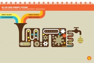 [click for full graphic, summary]
Before Shell I saw complex information needing complex visual solutions. But, confronted by the abstract nature of the Shell scenario material, I decided I needed a new approach. So I created a simple visual language that was flexible and intuitive, bringing instinct into what had before been a purely logical exercise.
Simplicity brings the complex to a larger audience, both intellectually and geographically. The main benefit I feel I can bring to the world of complexity is a vision of “simplify.” Over the course of three decades I have invested intense work into developing a simple visual language for new and existing communications.
For example, last year I worked with the WEF scenario team on a series of posters visualizing the Future of Government. One of the titles was formerly Datocracy, later called, “e1984.” This poster, in particular, talks of a future where data plays an intriguing part.
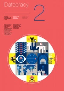 [click for full graphic, summary]
Where am I going?
Creative people never want to know. Not knowing is the fun. But my aim is/has always been to bring my vision to different and new areas of work. For instance advertising or public space, I would love to do a campaign that used data to inform the mass audience. The Shell, New Energy Future campaign came close.
Many thanks, Peter, for such brilliant insights into the development of the now infamous infographic. The fact that your work focuses on capturing complexity through ideas is one that will appeal to all of us with a story to tell, and increasingly, more data to help us do so. For further examples of Peter’s work, we suggest perusing his online collection and website, and of course, follow him on Twitter . Be sure to let us know what you think at Markets For Good.