Today we feature a rather special piece. A friend of the site and digital charity consultant Zoe Amar recently attended the British Library exhibition on ‘Beautiful Data’ – the twist being the focus is on data from as early as 1854. It puts things nicely into perspective when we think of the sudden emphasis on data visualization, or for those of us who consider ourselves data pioneers. Florence Nightingale – well known social reformer and founder of modern nursing during the Crimean War – is somewhat less renowned as a leading statistician and early data scientist. Her works are just one of many featured in this truly unique exhibition, running at the British Library until May 26th, and thoroughly worth your time. For those not in London, we hope the following article brings this data to life.
—
I’ve been talking to lots of charities recently about transparency, data and infographics. So I jumped at the chance to visit the Beautiful Science exhibition at the British Library.
The exhibition aims to show how scientific data can be presented in graphics. Infographics are often thought of as a very modern idea but the images on display go back several hundreds of years to the 17th century. It just goes to show that finding innovative ways to present data is nothing new.
Many charities now use graphics to showcase their impact, and having visited the exhibition, I’ve realised that nonprofits could do so much more with this medium. Here’s what I learned.
- Visuals are a great way to tell a story
As well as being the founder of modern nursing, did you know that Florence Nightingale was a statistician and design whizz? Her rose diagram below shows that far more soldiers died from preventable epidemic diseases (shown in blue) than from wounds inflicted on the battlefield (red) or other causes (black) during the Crimean War of 1853-56.
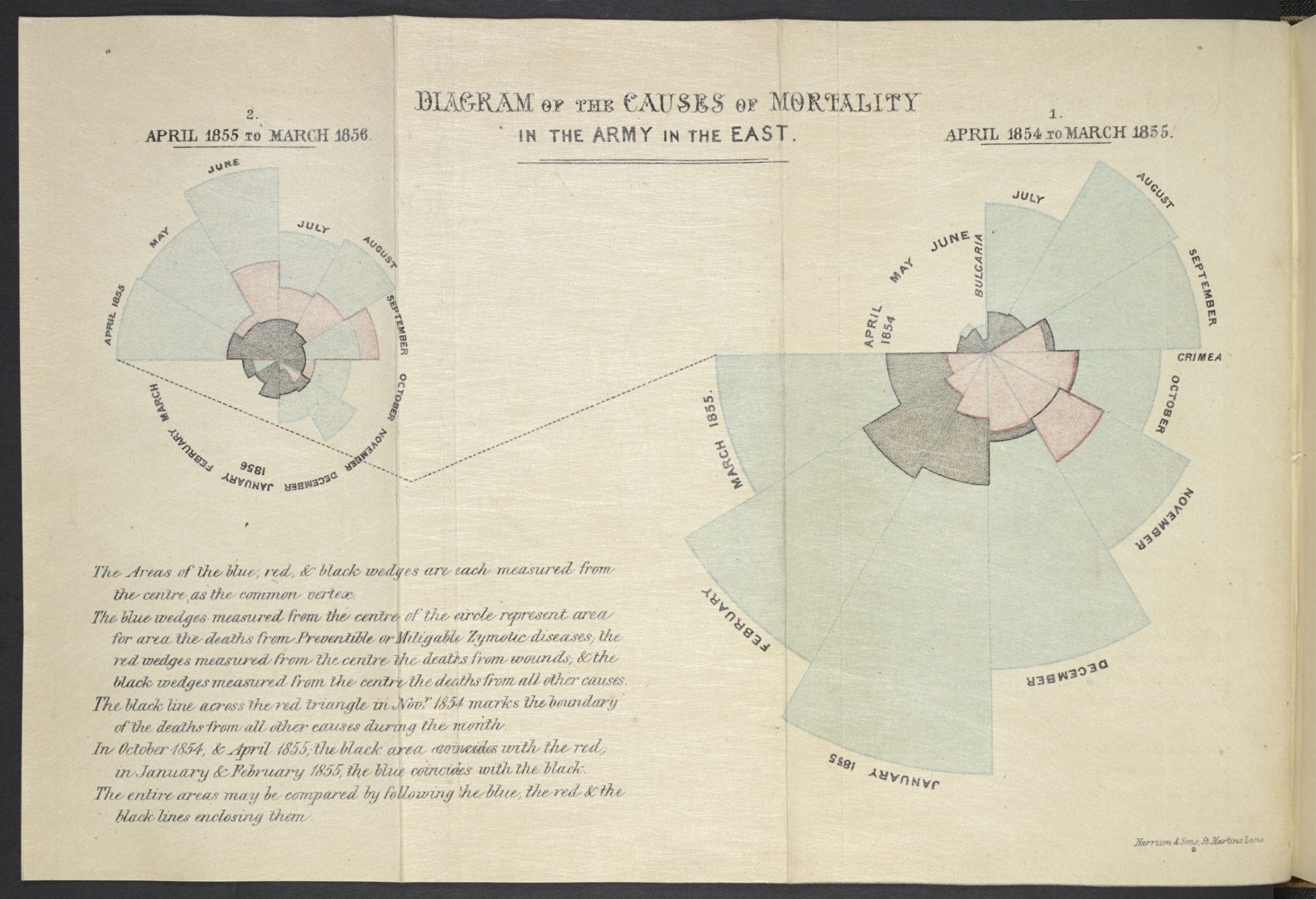
Graphics are the perfect way to pack a punch with the point your organisation is trying to illustrate. This graphic works well because it focuses on one key point about preventable diseases. Your charity may be awash without data, but what is the one thing you’d like people to remember once they’ve seen your infographic?
- Graphics are good for asking questions and stimulating debate

In this graphic Victorian statistician William Farr plotted cycles of temperature and cholera deaths for 1840-50. He thought (incorrectly) that cholera was spread by ‘bad air’ evaporating from the Thames. Farr established the first national system for collecting statistics and a data led public health approach.
What I love about this graphic is that it’s not a fait accompli. Farr is using the graphics as a way to spot patterns, explore ideas and solve the problem of how cholera is spread. Nonprofits often feel under pressure to share their data in a nice neat package where all the questions have been answered. But if you can take people with you on a journey of discovery with your research, drawing attention to your organisation’s cause in the process, then that’s very powerful.
- Are interactive graphics the future?
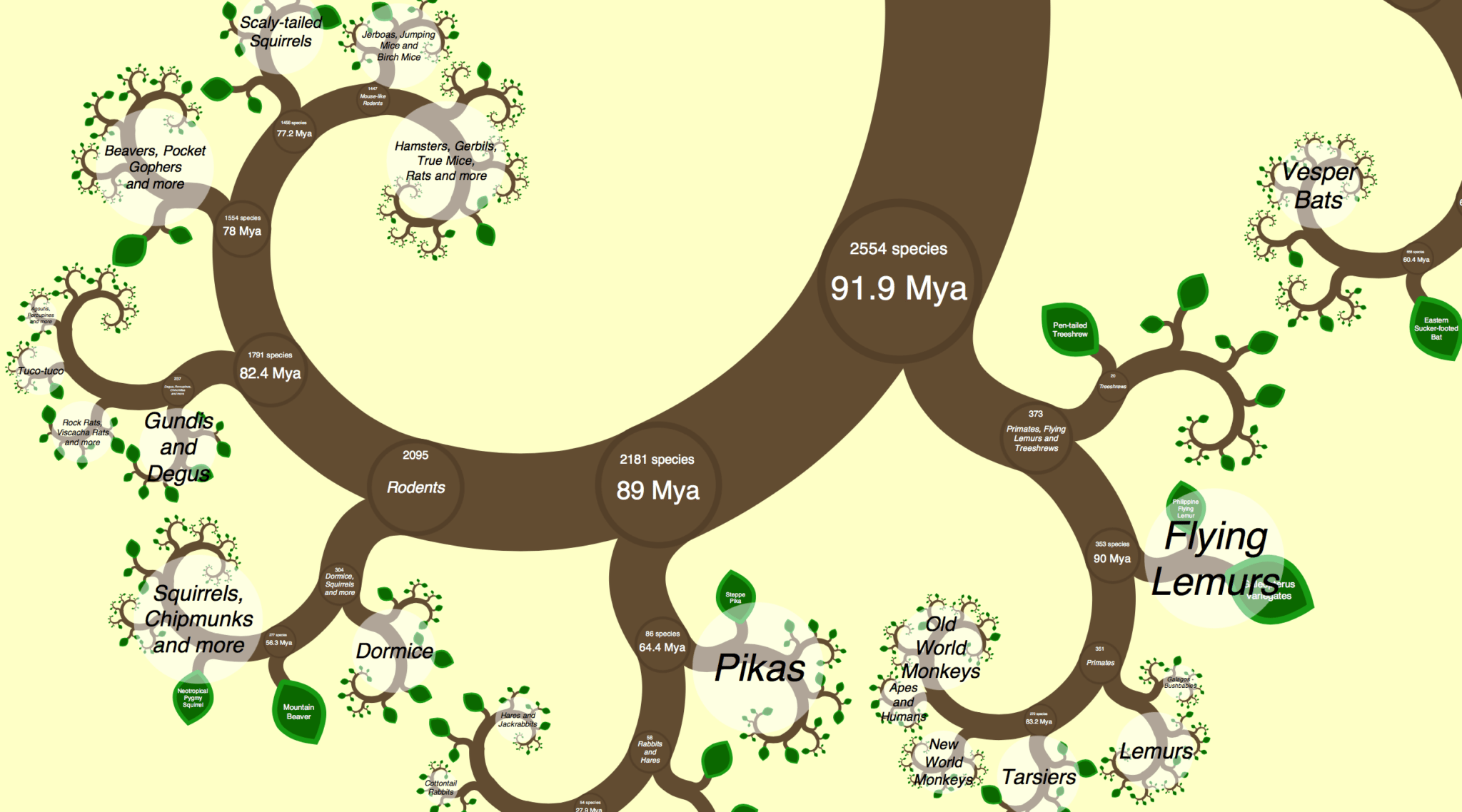
One Zoom Tree by James Rosindell (2012) is an interactive graphic which allows you to explore the evolutionary relationships between tens of thousands of mammals, birds, reptiles and amphibians. It includes audio from the British Library’s wildlife sound collections.
It’s beautiful and will capture people’s imagination about science. The right graphics could help excite people about your charity too. A word of warning though- this kind of interactive graphic won’t work as well on a mobile, but would be good on a stand in public places.
Looking at these three graphics and the exhibition as a whole, charities need to do the following when visualising their data:
- Have a clear purpose for the infographic- don’t just bombard people with data. What point do you want to make? What emotions do you want people to feel? What do you want people to do once they’ve seen it?
- Use graphics to ask powerful questions, as well as show impact.
- Think about whether it will work on mobile.
- Remember that this is ultimately about people, not just numbers. What is the human story behind the data?
Beautiful Science runs at the British Library until 26 May 2014. All images in this blog are copyright of the British Library.
Many thanks to Zoe Amar for such a wonderful write up. Make sure you tweet Zoe (and us!) some of the great art. If you have any suggestions for similar articles or write ups of events or exhibits, get in touch, via email.