Beth Kanter's New Column
This is the first in a regular column by Beth Kanter called “Between the Dashboard and the Chair,” which will focus on the cultural change, capacity building, and practical tips and skills for using data for learning for nonprofits.
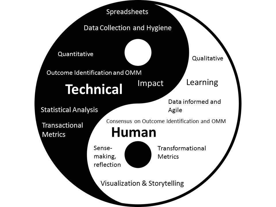
The Human Side of Nonprofit Data Practice is the Yin, Technical the Yang
Good data practice is not just about the technical skills. There is a human side to nonprofit measurement and data . It is found between the dashboard and the chair. It includes organizational culture and its influence on decision-making – from consensus building on indicators, agility in responding to data with action, and sense-making. It is the human side that helps nonprofits use their data for learning and continuous improvement.
Effective nonprofit measurement and data practice requires a balance of both the human side and the technical. It is like yin and yang, because these seeming contrary ideas and skills sets are actually complementary, interconnected and interdependent.
In the world of nonprofit data, we might look at yin yang narrowly as data visualization and spreadsheet data, but I’d like to frame it more broadly as the technical and the human.
This column will examine some common situations where the balance gets out of whack, while offering examples of how some nonprofits have kept the yin and yang of their data and measurement practices in check. You’ll find lots of tips, examples, and resources that will answer questions like this:
- What are the tips and techniques for presenting data results to your board or senior management?
- How can we get past counting beds and heads and measure transformation?
- How can we get started with using data to support experiments?
- Can real-time data help our organization?
- Don’t Fear the Spreadsheet!
- How do we extract learning from our data?
- What are some examples of nonprofits using qualitative data effectively?
- How do you create useful data visualizations if you don’t have a graphic designer on staff?
- Our organization is allergic to spreadsheets, how do we find a data scientist to help us for free?
We all know that the first step when collecting data to measure a strategy or program is to identify outcomes, which is also the single most important metric that tells you if you are on track. That’s easier said than done. It is often easy for nonprofit staff to describe results and match a KPI, but it can be much harder to get consensus. For example, the board may have different interpretation than staff or marketing director and fundraising directors may have different interpretations.
This classic Dilbert cartoon says it all. It is an all too familiar situation where an organization has a dashboard with all the bells and whistles to track its progress, but when it comes to decision making the data is ignored because of organizational politics. Or, metrics are gathered to justify a strategy favored by organizational leaders.
How to avoid this? Using design thinking and consensus building facilitation techniques and taking the time to identify and discuss can help. The critical step of getting buy-in on the data and an organizational commitment to stop making gut decisions is what I will explore in the next column. I’ll be sharing two case studies and lots of helpful tips.
Thanks to Beth, for kicking off her brand new column on Markets For Good – we all really appreciate Beth taking the time to write regularly for us, so be sure to tweet her your questions, comments and concerns, and maybe they’ll feature in a future post.
In the mean time, following on from this introduction, Beth’s next post will arrive on your dashboard in just one week’s time. Until then, be sure to follow her on Twitter for updates, and of course, enjoy her own blog.