Jake Porway, founder and executive director of DataKind, explains that "data visualization without rigorous analysis is at best just rhetoric and, at worst, incredibly harmful."
“I love big data. It’s got such potential for storytelling.” At DataKind, we hear some version of this narrative every week. As more and more social organizations dip their toes into using data, invariably the conversation about data visualization comes up. There is a growing feeling that data visualization, with its combination of “engaging visuals” and “data-driven interactivity”, may be the magic bullet that turn opaque spreadsheets and dry statistics into funding, proof, and global action.
However, after four years of applying data-driven techniques to social challenges at DataKind, we feel that data visualization, while it does have an important place in our work, is a mere sliver of what it takes to work with data. Worse, the ubiquity of data visualization tools has lead to a wasteland of confusing, ugly, and sometimes unhelpful pie charts, word clouds, and worse.
Ugh.
The challenge is that data visualization is not an end-goal, it is a process. It is often the final step in a long manufacturing chain along which data is poked, prodded, and molded to get to that pretty graph. Ignoring that process is at best misinformed, and at worst destructive.
Let me show you an example: In New York City, we had a very controversial program called Stop and Frisk that allowed police officers to stop people on the street they felt were a potential threat in an attempt to find and reclaim illegal weapons.
After a Freedom of Information Act (FOIA) request by the New York Civil Liberties Union (NYCLU) resulted in the New York Police Department (NYPD) releasing all of their Stop and Frisk data publicly, people flocked to the data to independently pick apart how effective the program was.
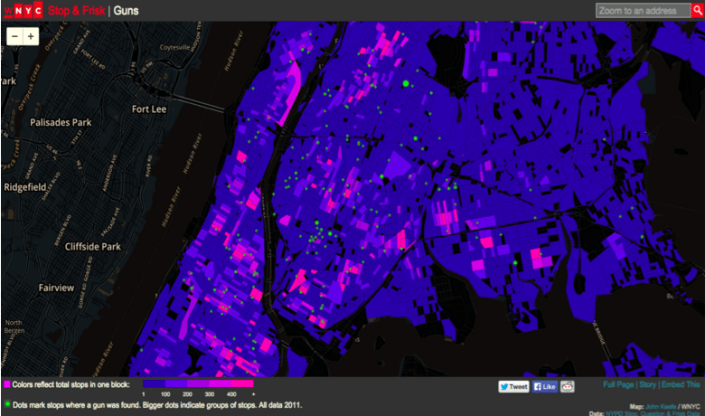
The figure below comes from WNYC, a public radio station located in New York City. Here they’ve shaded each city block brighter pink the more stops and frisks occurred there. The green dots on the map indicate where guns were found. What the figure shows is that the green dots do not appear as close to the hot pink squares as one would believe they should. The implication, then, is that Stop and Frisk may not actually be all that effective in getting guns off the street.
But then a citizen journalist created this map of the same data.
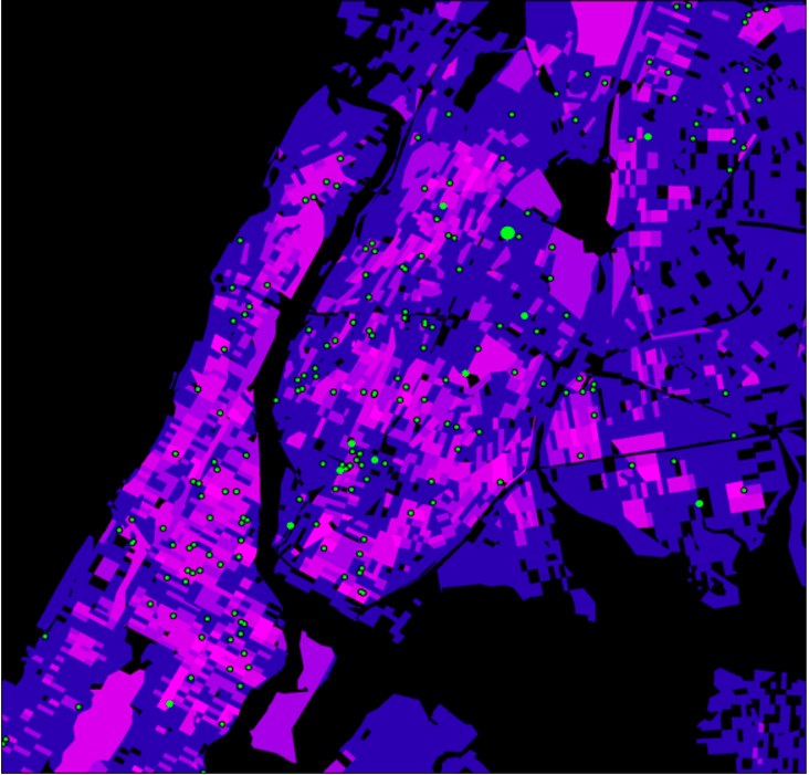
By simply changing the shading scheme slightly he notes that this map makes the green dots look much closer to the hot pink squares. In fact, he goes further to remove the artificial constraints of the block-by-block analysis and smooths over the whole area in New York, resulting in a map where those green dots stare unblinkingly on top of the hot-red stop and frisk regions.
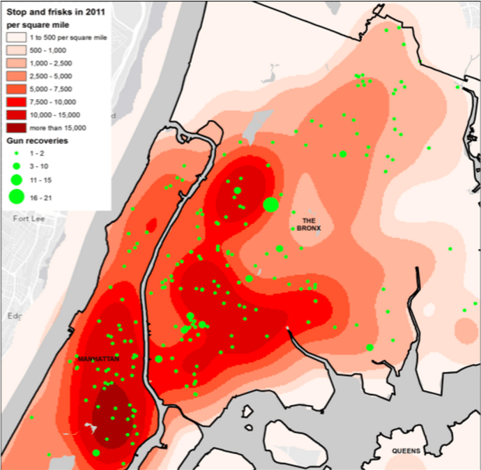
The argument this author makes visually is that Stop and Frisk does in fact work.
So who’s right here? Well both of them. And neither of them. These pictures are just that – pictures. Though they “use” data, they are not science. They are not analyses. They are mere visuals.
When data visualization is used simply to show alluring infographics about whether people like Coke or Pepsi better, the stakes of persuasion like this are low. But when they are used as arguments for or against public policy, the misuse of data visualization to persuade can have drastic consequences. Data visualization without rigorous analysis is at best just rhetoric and, at worse, incredibly harmful.
“Data for Humans vs. Data for Machines”
The fundamental challenge underlying this inadvertently malicious use of data comes, I believe, from a vagueness in terminology. When people crow about “the promise of data”, they are often describing two totally different activities under the same umbrella. I’ve dubbed these two schools of thought “data for humans” vs. “data for machines”.
Data for Humans: The most popular use of data, especially in the social sector, places all of the emphasis on the data itself as the savior. The idea is that, if we could just show people more data, we could prove our impact, encourage funding, and change behavior. Your bar charts, maps, and graphs pointing-up-and-to-the-right all fall squarely into this category. In fact almost all data visualization falls here, relying on the premise that showing a decisionmaker some data about the past will be all it takes to drive future change.
Unfortunately, while I believe data is a necessary part of this advocacy work, it is never sufficient by itself. The challenge with using “data for humans” is threefold:
- Humans don’t make decisions based on data, at least not alone. Plato once said “Human behavior flows from three main sources: desire, emotion, and knowledge.” I want to believe he listed those aspects in that order intentionally. Study after study has shown that humans rationalize beliefs with data, not vice versa. If behavior change were driven by data and graphs alone, we would be 50 years into a united battle against climate change. Conversely, we will leap to conclusions from data visualizations that “feel” right, but are not rigorously tested, like the conclusions from the Stop and Frisk images above.
- The public still treats data and data visualization as “fact” and “science”. I believe the public has gained enough visual literacy to question photojournalists or documentary filmmakers’ motives, aware that theirs is an auteur behind the final piece that intends for us to walk away with their chosen understanding. We have yet to bring that same skepticism to data visualization, though we need to. The result of this illiteracy is that we are less critical of graphs and charts than written arguments because the use of data gives the sense that “fact” or “science” is at work, even if what we’re doing is little more than visually bloviating.
- The data or visualization you see at the end of the road is opaque to interrogation. It is difficult, if not impossible to know where that “58%” statistic or that flashy bar graph came from, grinning up at you from the page. Because we don’t have ways to know how the data was collected, manipulated, and designed, we can’t answer any of the questions we might want to raise above. If point 2 means we need to treat data visualization as photojournalism, then this point implores us to go further to requiring forensic photographers in this work.
Data for Machines: For these reasons, DataKind specializes in projects focusing on what we refer to as “Data for Machines”. The promise of abundant data is not that we can show people more data, but that we can take advantage of computers, algorithms, and rigorous statistical methodologies to learn from these new datasets. The data is not the end goal, it is the raw resource we use to fuel computer systems that can learn from this information and, in many cases, even predict what is likely to happen in the future.
For example, instead of engaging in the Stop and Frisk gallery debate above, DataKind volunteers loaded the NYPD data into computers and created statistical models to rigorously test whether or not racial discrimination was occurring disproportionately in different parts of the city. While the models needed further evaluation, this analysis shows how data should be used. People shouldn’t try to draw conclusions from pictures of data – we’re notoriously bad at that as humans – we should be building models and using scientific methods to learn from data.
The Trials of Data Visualization
I would happily end the article with the paragraph above, arguing that we all embrace the “data for machines” approach to social change, but that’s a little unsatisfying. Of course data visualization will continue to have a place in behavior change, so let’s talk about when it does and does not work.
First, some pitfalls:
The new medium imitates the old: Marshall McLuhan said “We look at the present through a rear-view mirror. We march backwards into the future”. What this quote means to me is that we tend to see the future through the lens of the past, or it’s hard to imagine how a new medium is used at first.
When you hear about data visualization, your thought is probably not to use it to convey machine learning results. No, most people’s’ first thought is to take what we’ve done in the past and vizify it! The first thing most groups focus on is their annual impact report, a chance to take the staid spreadsheets of the past and give them some pizazz!
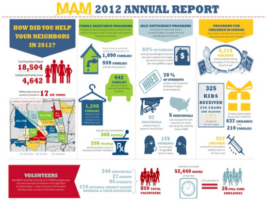
Arguably this figure is more appealing than dry numbers, but I think of these infographics as “deep fried spreadsheets”. Sure, they are perhaps more appetizing than boring Excel rows and columns, but they don’t actually provide any additional nutritional value. In fact, when I see these infographics I often wish I just had the original spreadsheet to look at. Beware of visualizing just because you can, instead ask if you are in fact conveying anything new.
Your tool won’t tell the whole story: Remember that, like it or not, people are subconsciously going to start drawing conclusions from your visualization as if they were fact. This phenomenon can lead to doubly challenging conclusions when your visualization itself is connoting misleading information.
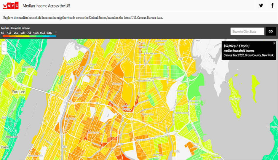
Take WNYC’s map of median incomes above. Ignoring some of the design choices in this figure that are already suggestive (e.g. the color scheme alone casts blame with a green = rich = “good”, red = poor = “bad” color scheme), there are subtle issues with what this figure conveys. There are some areas on this map that are bright green, indicating they have very high median incomes and may therefore lead you to believe they are richer areas. However, ask any social worker what those areas are like and they’ll tell you that a few green areas are in fact some of the poorest areas in the city. So what happened? The rub is that this figure is showing median household income. In some of these poor areas, people share a single apartment with 10+ people, driving up the household income, but clearly that does not equate to the standard of living we equate with a high median income. Here we are challenged with a subtle, pernicious lack of provenance in the data. How would one even question that finding without knowing the true conditions of those blocks? Data visualizations exist to help us quickly scan large amounts of information without having to know the ins-and-outs of the underlying condition, so it is incumbent on us data visualization designers to communicate exactly what our tools are conveying.
Context is key: My thesis may imply that some savvy statisticians are all you need to transcend these data visualization pitfalls. Of course, tech alone is not the answer either, as illustrated by this case from a hackathon that Uber ran. During that hackathon, data scientists and technologists analyzed Oakland Police Department data and found that prostitution arrests spiked on Wednesdays. This finding not only lead to this cringe-worthy illustration — ah, the pains of working in an industry run by 23 year old dudes — but also the conjecture that this spike may occur because that’s when Social Security checks are delivered.
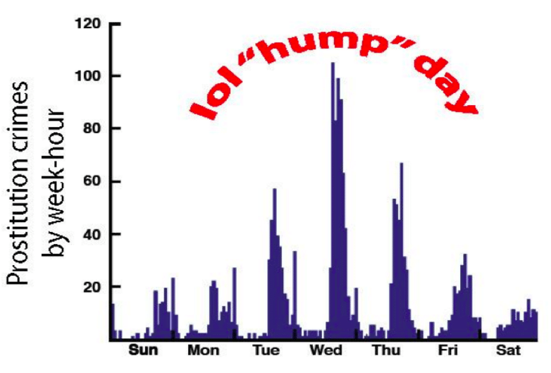
While that could be true, it feels irresponsible to draw that sociological conclusion from a bar chart alone. In fact, someone chimed in on the comments of this post to point out that the Oakland PD just happens to do vice arrests on quiet nights, so it may not be that there are more prostitution activities on Wednesdays, merely more prostitution arrests. The takeaway is that the magic combination for making social change with data is equal parts technical analysis and local context.
This is hardly a comprehensive list of shortcomings, but I think you can start to see how these three common pitfalls – the challenge of using the new medium in new ways, the fact that visualizations can actually conceal truths and, worse, that technologists can read mistruths in them — are all hurdles to doing this work.
Celebrating Visualization
OK, so if you’re still with me, let me end with some good examples showing the power of data science to help us ask better questions and understand our world. No surprise, creating data visualization well simply entails designing in a way that leads people to make scientific conclusions themselves.
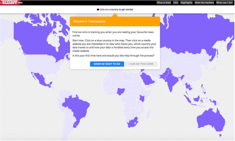
One of the projects I really like is from Tactical Tech Collective (TTC) and it’s called Trackography. It shows what countries are tracking you while you browse the Internet. The innovation that TTC makes here is that, instead of plopping you into a complicated tool from which to make your own conclusions, they have a demo to show you how to use the tool. This guided tour helps prevent you from making spurious conclusions and also adds a much nicer user experience.
There are many other examples of insightful, persuasive, and downright clever data visualizations, but perhaps one of the best visualization practices I know of is to turn the idea of visualization on its head. Data visualization is incredibly good for allowing one to ask questions, not answer them. The huge amount of data that we have available to us now means that we need visual techniques just to help us make sense of what we need to try to make sense of.
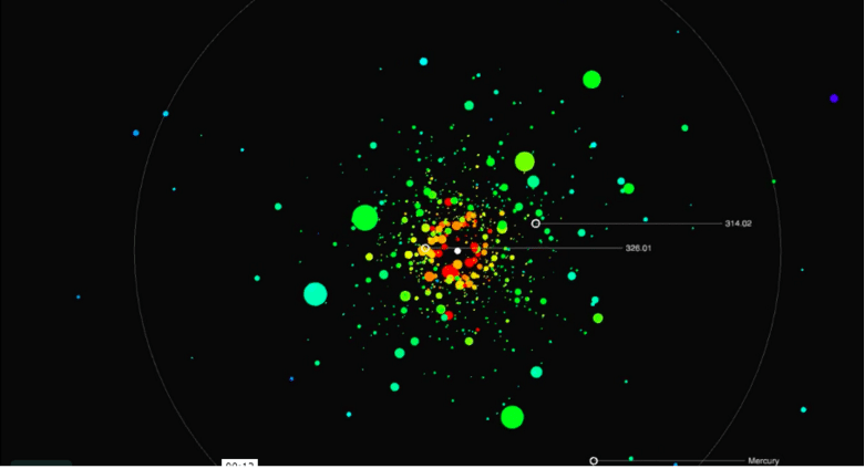
Jer Thorp builds visualizations that are used not to answer, but to ask questions. He built the visualization above to show the data from the Kepler mission, a NASA mission looking for exoplanets. Despite the profundity of discovering planets that could very well hold life in the universe, NASA’s result was a sad, boring table of information in the back pages of an academic paper. Jer built a visualization that allowed one to experience the planets live, as if they were all revolving around the same star. With this visualization, one immediately starts to wonder. “Huh, why is that planet so cold for being so large? Why does that little planet stand out out there?” It is this presentation of the data that invites questioning instead of seeking to give all the answers. Though it requires more technical proficiency, I believe it pays off massively.
So where do we go from here?
First off, you can boycott the tyranny of pie charts and word clouds, rail against those three pitfalls, and share these last two examples far and wide. But I think we can also all go out and start thinking about how data can truly be used to its fullest advantage. Aside from just using “data for machines”, the best data visualization should raise questions and inspire exploration, not just sum up information or try to tell us the answer. Today we have more information than ever before and we have a new opportunity to use it to mobilize others, provided we do so with sensitivity. Now, more than ever, we need to all be out there on the front lines looking beyond data visualization as merely a way to satisfy our funders’ requirements and instead looking at data as a way to ask deep questions of our world and our future.
To stay up to date with the latest Markets For Good articles and news, sign up to our newsletter here. Make sure that you are also following us on Twitter.