Beth Kanter, Master Trainer, Blogger, and co-author of “Measuring the Networked Nonprofit,” winner of 2013 Terry McAdam Nonprofit Book Award: “You don’t need to be a trained data scientist or be the world’s best graphic design artist to visualize your data and tell a compelling story. And it doesn’t require a lot of time or expensive tools to create infographics and eye-catching intelligent visualizations that allow data to tell a compelling story. I call this “Do-It-Yourself Data Visualization.”
Data Visualization can be a terrific sense-making technique. My personal rule in measurement is to spend 30% collecting and organizing data and 70% thinking about what it means. For me, I need to see patterns and link it back to strategy and tactics. And, there is no better way consolidate your insights by expressing them as DIY infographic – which simply be displaying a clear chart illustrating your key insight or reporting with an infographic. In “The Power of Infographics” Mark Smickilas offers some good recipes for creating your own data visualizations. It just requires some inspiration and a little bit of perspiration. For inspiration, check out this Pinboard of nonprofit infographics – many created with free tools and nonprofit staffers.
Now, comes the perspiration part. You need to learn basic design skills and hone your visual thinking skills. After discovering insights, you need to understand how to say it with a chart. And then there is mastering the tools. I’ve been looking for free, low-cost, easy-to-master tools and templates to reduce some of the sweating. Here they are:
01. Excel Spreadsheets
he best place to start is with software that your nonprofit is already using – Excel. With a little tweaking, you can create sleek and elegant charts and graphics as part of your reports. Here’s six tips on how to easily make beautiful charts in Excel. If you are allergic to Excel and want a super easy way to create elegant charts and graphics, check out Chartwell Fonts. This font lets you type a simple strings of numbers and transform them into charts with one click. The visualized data remains editable, allowing for hassle-free updates and styling. You have to slow down to create the charts and you really how to think about you want to present your data. It forced me to really think about the data and it generated additional insights.
02. Microsoft PowerPoint or Publisher
Both of these old standards have layout tools that make it easy to compose an infographic or a single chart . I like the Smart Art templates in PowerPoint to help me see patterns in my data. Hubspot has just published this awesome collection of infographic templates for Powerpoint. And, ironically, the templates are not just pretty, but they help guide you in planning and designing your infographic. Take this template that helps you think about how to use color and chunk your information. You can also use Microsoft Publisher and stock clip art and illustrations. One of my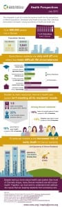 favorite illustration resources is The Noun Project which is a visual language site that collects and organizes symbols and icons for public use. Check out this example (right) from a healthcare nonprofit in Colorado created with clip art in Publisher.
03. Infographic and Data Visualization Tool Suites
There are tool suites out there that combine all of the above into one package. One of the popular ones is PiktoChart which has a free version and infogr.am, a free tool to create interactive infographics. There are scores of free, low-cost, and inexpensive tools for data visualization. Let me share one final secret: It was less time-consuming to use simple tools, because I could then focus more on what the data means instead of trying to figure out how a particular tool works.
What are your favorite DIY data visualization tools? How are you honing your visual thinking and sense-making skills?