Beth Kanter's New Column
Following on from last week’s introductory post, Beth Kanter continues her column, focused on the cultural change, capacity building, and practical tips and skills for using data for learning for nonprofits.
How Human-Centered Design Methods Can Help You Design A Better Dashboard
Take a look at any nonprofit dashboard and the most effective ones probably have an organizational process that lies beneath. Dashboard design is more than simply clarifying outcomes and key metrics. Dashboard design should also inspire buy-in and continuous improvement by using “human centered design” methods.
But shouldn’t dashboards be designed by data scientists and graphic designers? Yes they can be part of the team, but anyone can be a designer! These are methods for developing solutions (any type) in service of people. By applying this approach to any program development or strategy and even your organization’s dashboard, your nonprofit can more innovative and get more impactful results.
Many times dashboard design is focused on “getting it done efficiently” and graphs and does not address the human side – buy-in, learning from data, and consensus on metrics. A focus on the bar charts without taking the time to understand the challenges and open up creative thinking will not inspire organizational buy-in which is so important.
Here are two stories about two very different nonprofits and how they approached designing their dashboards with human-centered design techniques.
Tracking for Impact and Learning
Edutopia, a project of the George Lucas Educational Foundation, is an online web site that creates and curates content that is distributed through mobile, social media, video, and offline channels. They also have a robust online community. The ultimate goal is to improve the quality of education. Their theory of change is about raising awareness of the issues and then inspiring, engaging and encouraging their audiences to take actions around this goal.
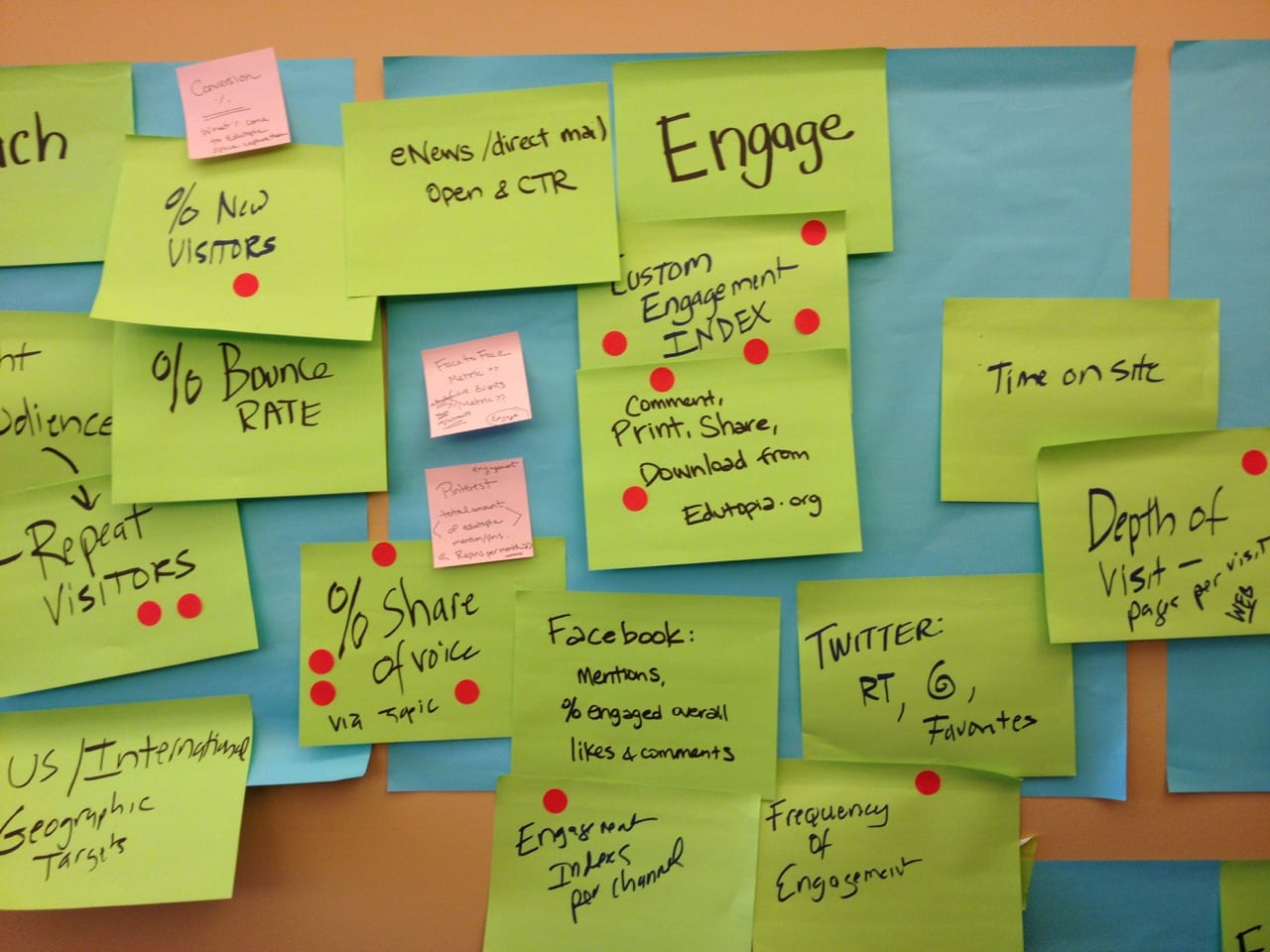
Their dashboard already did a great job at tracking impact metrics about the reach and size of their audience, but they wanted to go deeper in tracking engagement and taking action. With a large staff producing and marketing content, they also wanted a way to capture data for ongoing feedback to improve their content.
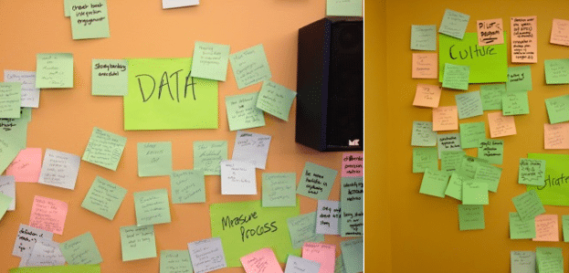
Again, using design-thinking facilitating methods, the process started with a presentation from the executive director on the strategy for the year and measurement. Staff were asked to use a technique called “Rose, Bud, Thorn” to identify strengths, challenges, and opportunities for change. They created a concept map of the different themes that emerged. While technical topics such data and measurement processes emerged, so did a lot culture change issues.
Next staff identified key impact metrics by creating a paper prototype of the dashboard on the wall, with sticky notes. Using a sticky dot voting process to identify metrics most important to senior management and the board and those most important to different staff departments, they were able to design different “views” – a high level for impact and more detailed version for “learning.”
What emerged from the conversation was a plan for impact reporting, but also a process for more intentional experimentation and learning linked to key metrics.
Metrics for Movements
GivingTuesday, a philanthropic movement to promote a national day of charitable giving that takes place the Tuesday after Thanksgiving, organized a convening of key stakeholders called “Measurepalooza.” The gathering followed on the heals of the “Best Practices Summit” where partners and participants came together to share and learn best practices and identified the need for the movement to also capture metrics beyond “dollars raised on the day” numbers.
In particular, they were interested in looking at transformational metrics such as donor engagement, building nonprofit capacity, and global reach.
As a movement, GivingTuesday needed to address and get consensus on two big measurement questions: What metrics should the movement as a whole measure? What should participants each measure for their individual campaigns?
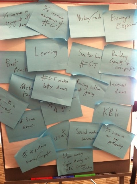
The session started with setting context on the accomplishments of the past year’s campaign and a summary of what was learned during the best practices summit. This lead to a discussion about the need to capture both “transactional” and “transformational” metrics related to specific outcomes as well as what and how to effectively use both quantitative and qualitative data for both movement level learning and for participating partners.
Through a facilitated design thinking process, small groups of participants created a draft of the Giving Tuesday movement level and partner level metrics. As a consensus building process, participants used “sticky dot” voting to identify the most important metrics (green for partners; red for the movement as a whole). This allowed everyone to see visually what the group consensus was and hone in what was most important.
Summary
Whether you are using data to inform a digital content strategy or to build a philanthropic movement, it is important to remember that effective measurement begins with people.
How has your organization achieved buy-in from staff or senior leaders about what data to collect for impact tracking? What are the processes that your organization is using to help ensure that data is used for decision-making and learning and not ignored?
As ever, thanks to Beth for her regular and invaluable insights. Be sure to follow her on Twitter for updates, and of course, enjoy her own blog.